

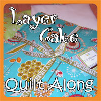
Konda, of Moose on the Porch Quilts, ran the very successful Jelly Roll Quilt Along and her newest venture starts November 2nd.
 I’m playing along this time – and even designing one of the blocks 🙂
I’m going to be making 2 samplers, one with a layer cake {April Cornell’s Prayer Flag}
and one with fat quarters ( I’ll show those fabrics next Tuesday)
Here are the fabric requirements as listed in the first quilt along post.
Fabric Requirements:
1 Layer Cake (or 12 fat quarters)
1 1/2 yards accent fabric
1 2/3 yards outer border
4 yards backing
2/3 yards binding
Size of Quilt: 64″ x 80″
Konda also answers some questions and gives a little bit of details in the post, so you’ll probably want to read all of it here.
 I have already decided that I will use one of these prints as the outer border.
I may wait to see what the blocks start to look like before I decide.
Or I might be pushed into which ever one I can find online!
 The next thing I need to decide on is what colour to use for my accent fabric.
There is a lot of blue in this layer cake.
 Orange/rust is the second colour.
 Green and yellow together have the same amount of fabrics as the orange.
 I would call these the neutrals in this fabric line. There are still colours in many of the prints, but the backgrounds are all a cream. I can’t really use cream as the accent fabric because it won’t look like an accent if it’s also in some of the block pieces – this could cause some blocks to recede visually or look bigger compared to its neighbours.
 This yellow piece shows {although rather poorly! my fault} that April Cornell added a chestnut brown as a complimentary colour to the line. It shows up in the prints as well.
 Here’s a piece of tone on tone chestnut fabric I have so you can see that it would work well, really well as an accent. But. It’s not the colour for me!
 I looked at my fabric colour wheel that I have taped to the outside of my cabinet.
The dark arrows show the main colours in the layer cake.
Mostly secondary colours.
Then I looked to the opposite {bottom} of the colour wheel to see what would match.
Not purple, but darker purple.
Not red, but burgundy.
I’m looking at using a solid colour, not a print, so that makes it a little tougher for me to choose!
I may end up ordering a more purple fabric AND a more red fabric and seeing which I like better.
I think the chestnut colour goes more towards the red spectrum. . .
What do you think?
Have you joined yet?!?
Stay tuned for next Tuesday’s Cake Talk:)
With Joy,
Sarah Vee
Leave a Reply
You must be logged in to post a comment.